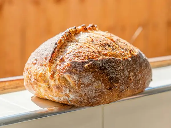

Sample product card
The everyday sourdough
A golden crust, an open crumb, and a slow, thoughtful rise.
Crumb & Oven / Style guide
A practical collection of the ingredients that make this bakery feel like home. Start here, then make it your own.
The brand recipe01 / Identity
An arched oven, a small loaf, and an open invitation. Keep the symbol and wordmark together whenever space allows.
Give the mark room to breathe.
Use warm light tones on dark surfaces.
Keep proportions intact. Avoid stretching, heavy effects, or placing the mark over busy photographs.
Download symbol02 / Palette
Soft neutrals do most of the work. Cocoa brings structure; terracotta adds a little warmth. Select a swatch to copy its color.
Color values follow the template’s shared palette.
03 / Typography
Expressive serif headings meet a quiet, practical sans serif. Both typefaces are served locally with the template.
Aa
Headings & brand · 500 / 600 / 700
Aa
Body & interface · 400 / 500 / 600 / 700
Headings organize your page like chapters in a book. H1 is the main title; H2 introduces a section; H3–H6 organize smaller parts inside it. Use the levels in order. The examples show their usual sizes on your screen.
Good things take time.
Fresh from our oven.
A little everyday ritual.
Simple ingredients. Thoughtful details.
Small batches, made with care.
The finishing touches.
Ten options, from a small note to a large headline. Choose the name that best fits what you want to say, then compare the examples below. Each option shows its size so you can see how they differ.
Made with care.
Made with care.
Made with care.
Made with care.
Made with care.
Made with care.
Made with care.
Made with care.
Made with care.
Made with care.
For paragraphs, start with Reading text or Comfortable reading. Save Tiny note for short captions. Choosing a larger size changes how the text looks; it does not change its H1–H6 heading level.
You can choose by the friendly names above. These matching style names are only needed when editing the website’s design settings or code.
| Name in this guide | Style name |
|---|---|
| Tiny note | text-50 |
| Small note | text-100 |
| Reading text | text-200 |
| Comfortable reading | text-300 |
| Intro text | text-400 |
| Small title | text-500 |
| Medium title | text-600 |
| Section title | text-700 |
| Page title | text-800 |
| Large headline | text-900 |
04 / Actions
One primary action at a time. Hover gently changes color; keyboard focus remains clearly visible.
Smaller & simpler
On a dark surface
05 / Fields
Labels stay visible. Hints add context. This form is a local example for testing field styles and validation; it does not send messages.
06 / Components
Reusable cards, labels, and filters keep the experience consistent as the bakery grows.
Sample product card
A golden crust, an open crumb, and a slow, thoughtful rise.
Product labels
Category filters / interactive example
Sample selection: All goods.
Icons / simple and familiar
07 / Rhythm
A shared spacing scale keeps small details tidy and larger sections unhurried. Rounded corners soften the structure.
08 / The finishing touches
Interaction should feel natural, never get in the way. Try the button, then use Tab to explore the guide with your keyboard.
Soft in. Soft out.
Start with the shared palette and type settings in css/tokens.css. The examples use the same component styles as the bakery. Update the brand name and logo lockups here when you personalize the template.
Swatch values and spacing labels read the shared settings automatically. The sample card and form copy are illustrative; they are not connected to the product catalog or an inbox.